

Strategy
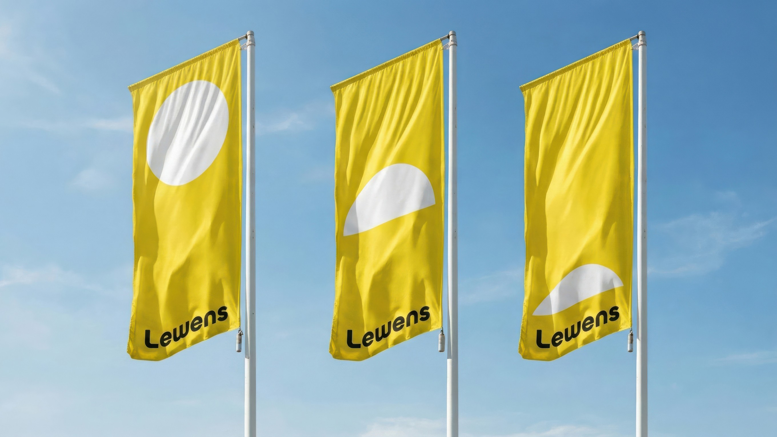
Workshops with the client made it clear that the new identity should be an evolution rather than a revolution. Research highlighted the company’s roots in Ludwigslust, its heritage as a family-run business and its strong commitment to manufacturing in Germany as key differentiators. These values came together under the familiar symbol of the sun, paired with the new tagline: “Hello Sunshine.”
Design
The goal was to give the brand a more confident, professional and timeless appearance. Together, we developed a clear, minimalist visual identity that brings structure to their content. The new logo combines a wordmark and symbol in a flexible system. The rising sun concept also extends into the layout, with the symbol consistently positioned on the right as a subtle reference to the company’s East German roots.
Results
Together with the client, we developed a flexible identity that adapts across different touchpoints while maintaining a consistent brand presence. I have been involved since the initial concept phase and am responsible for its implementation across a wide range of applications, including the corporate website and trade partner portal, social media, campaign posters, partial showroom concept, merchandise and a complete redesign of the product brochures.




Creative Direction
Christian Himmelspach
Art Direction
Daniel Schreck
Project Management
Jessica Wegelin
Malte Otto