Strategy
Research revealed a dated, impersonal corporate identity, while the city’s coat of arms remained a powerful symbol of local identity. Interviews highlighted residents’ strong connection to Leipzig and their desire for greater participation. The strategy was to evolve the city’s identity while preserving its heritage and putting citizens at its heart. This vision was captured in the guiding principle: “Leipzig grows sustainably.”
Design
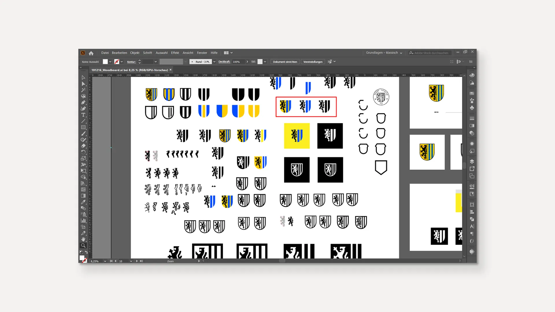
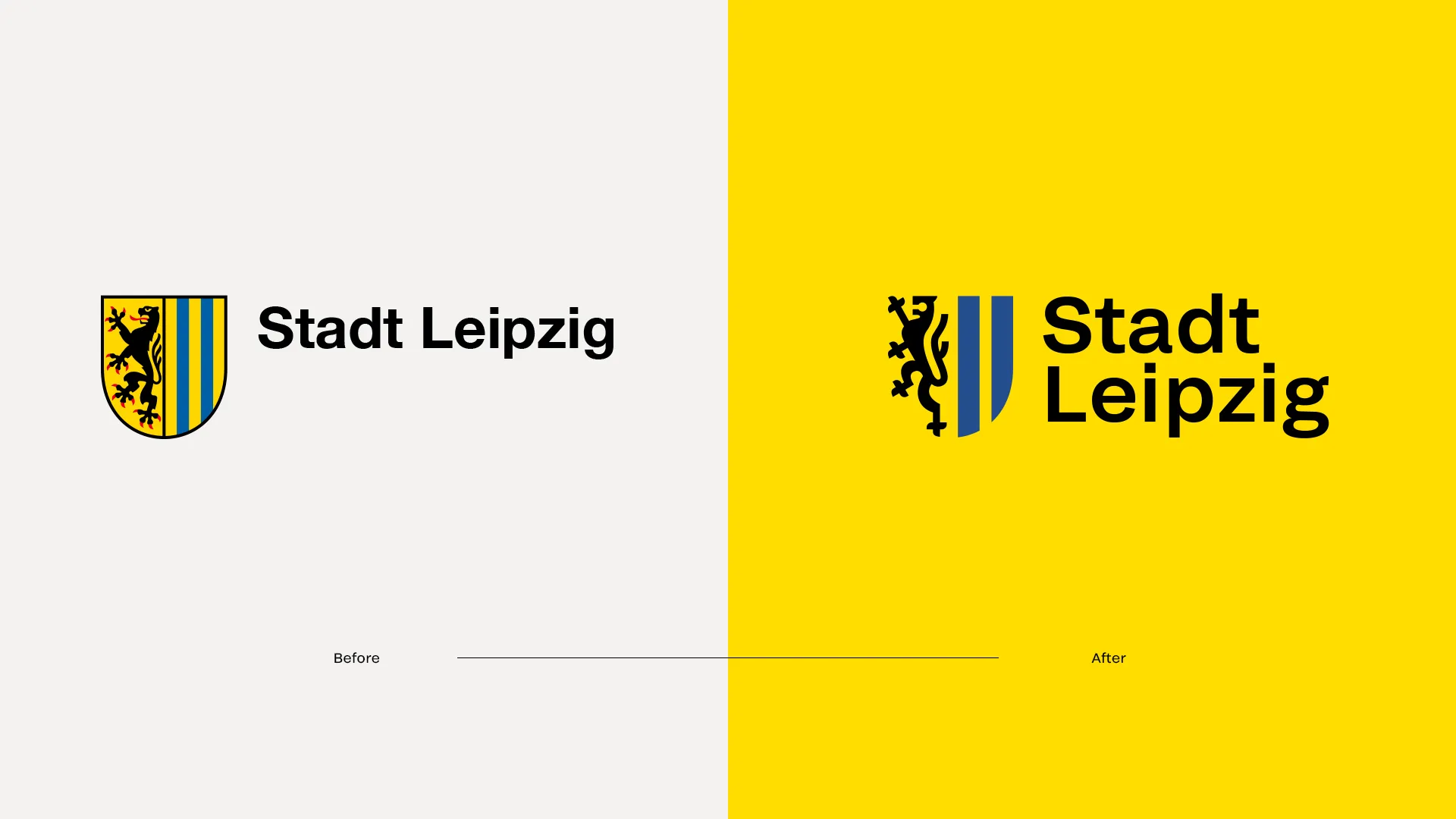
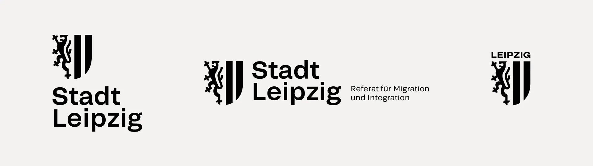
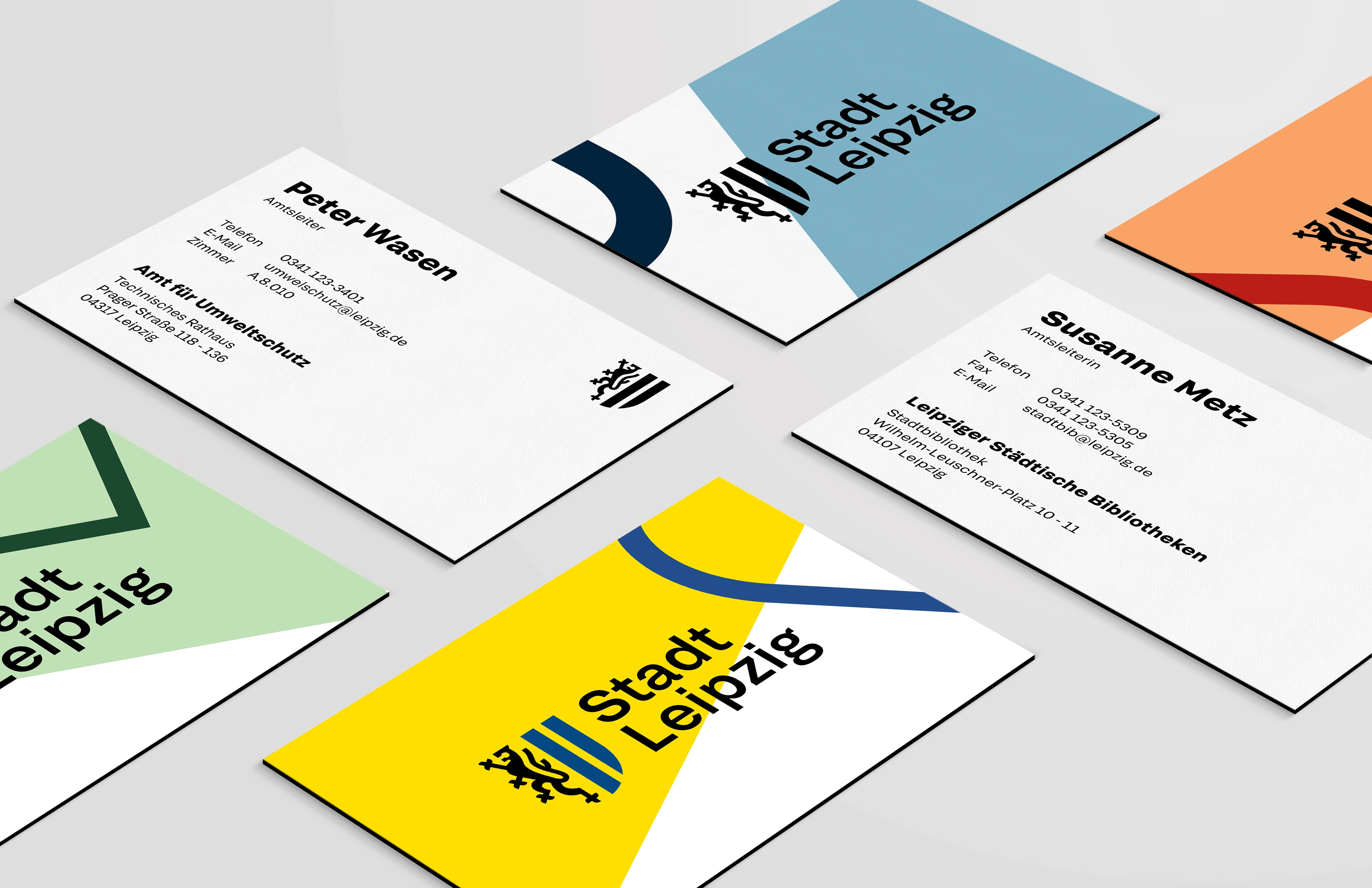
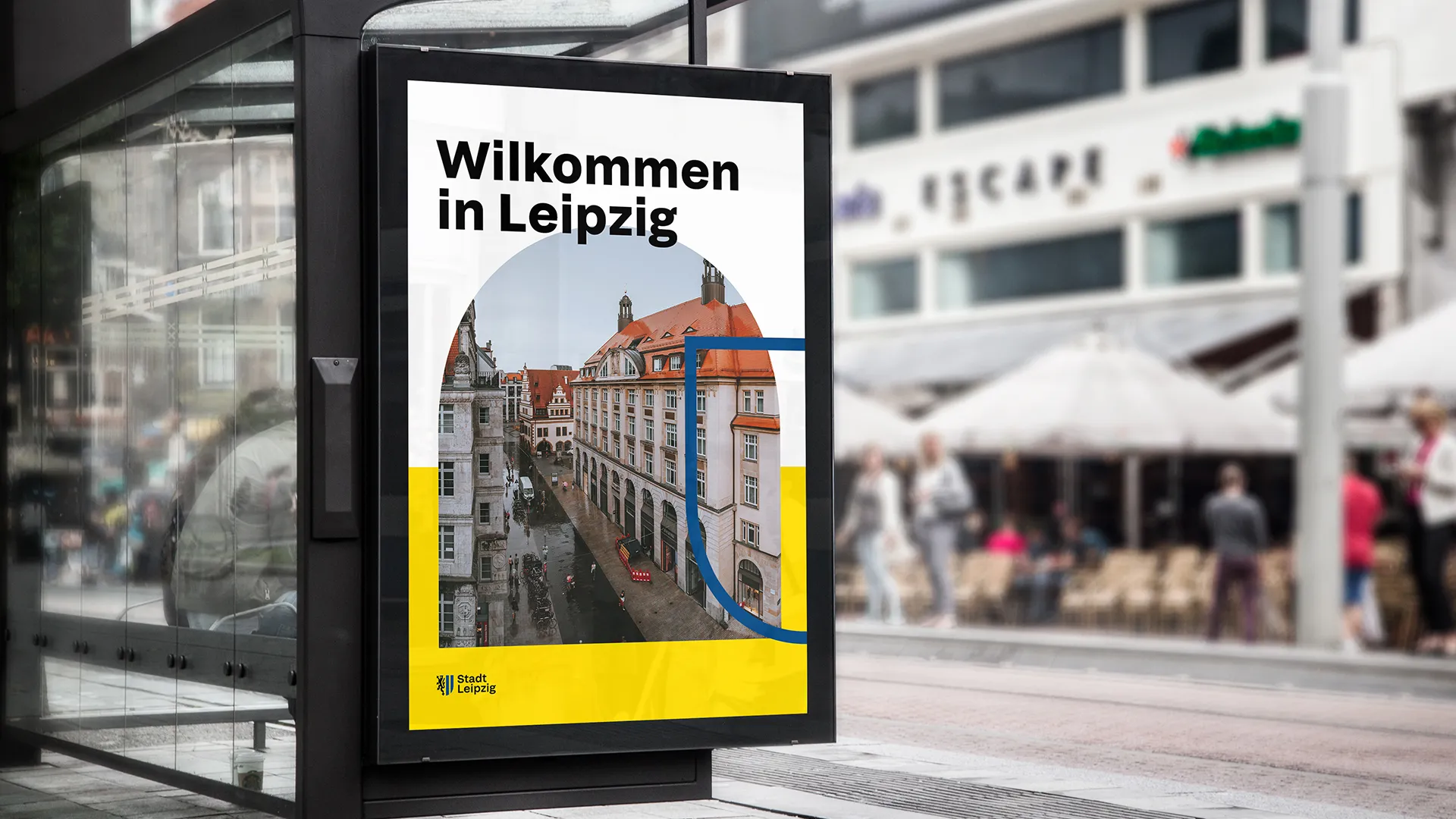
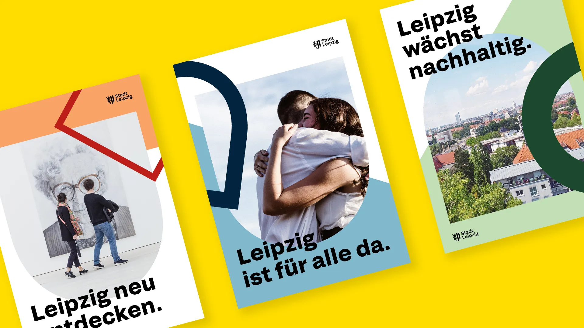
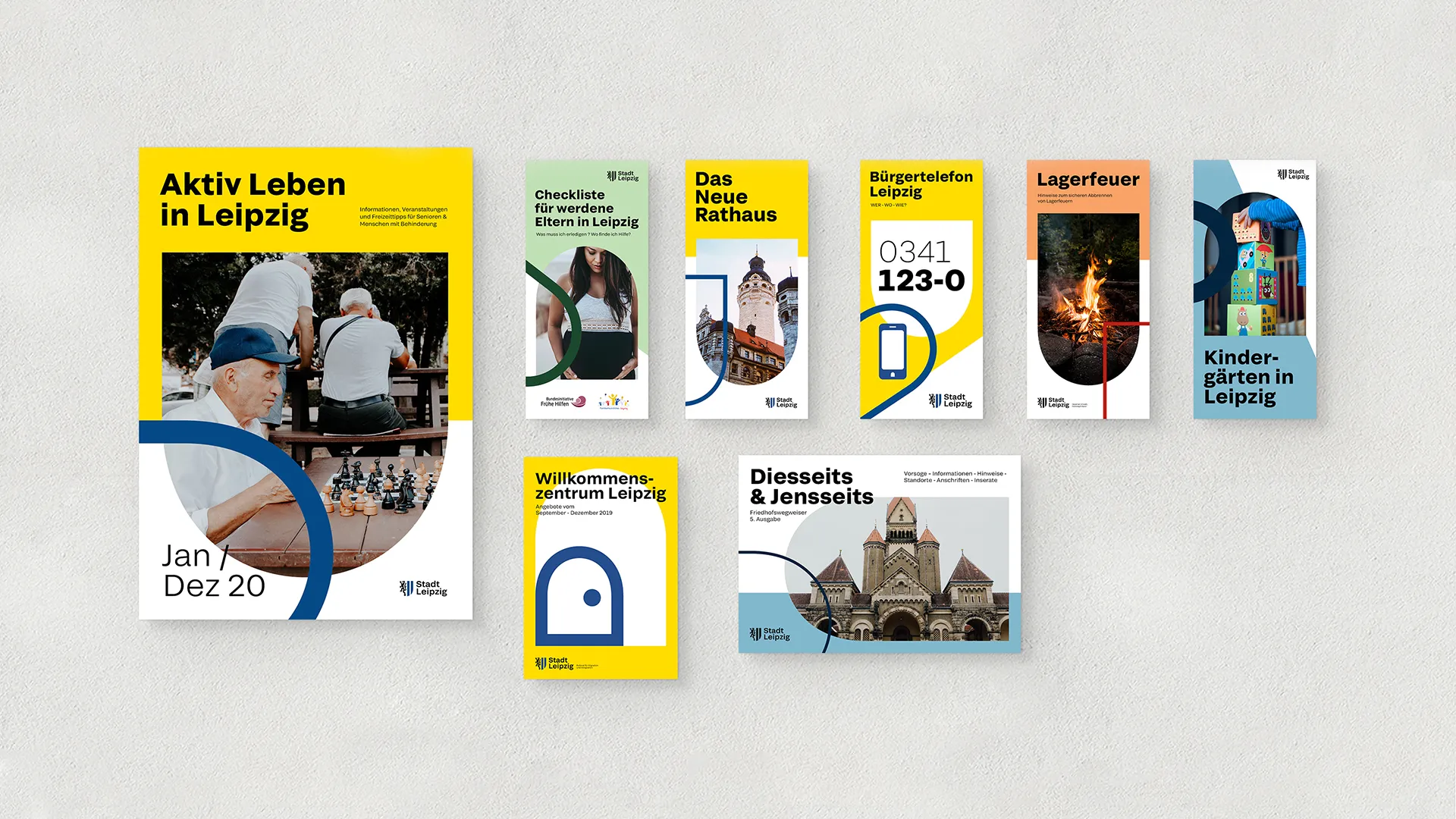
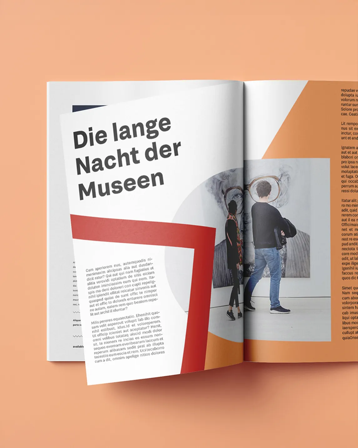
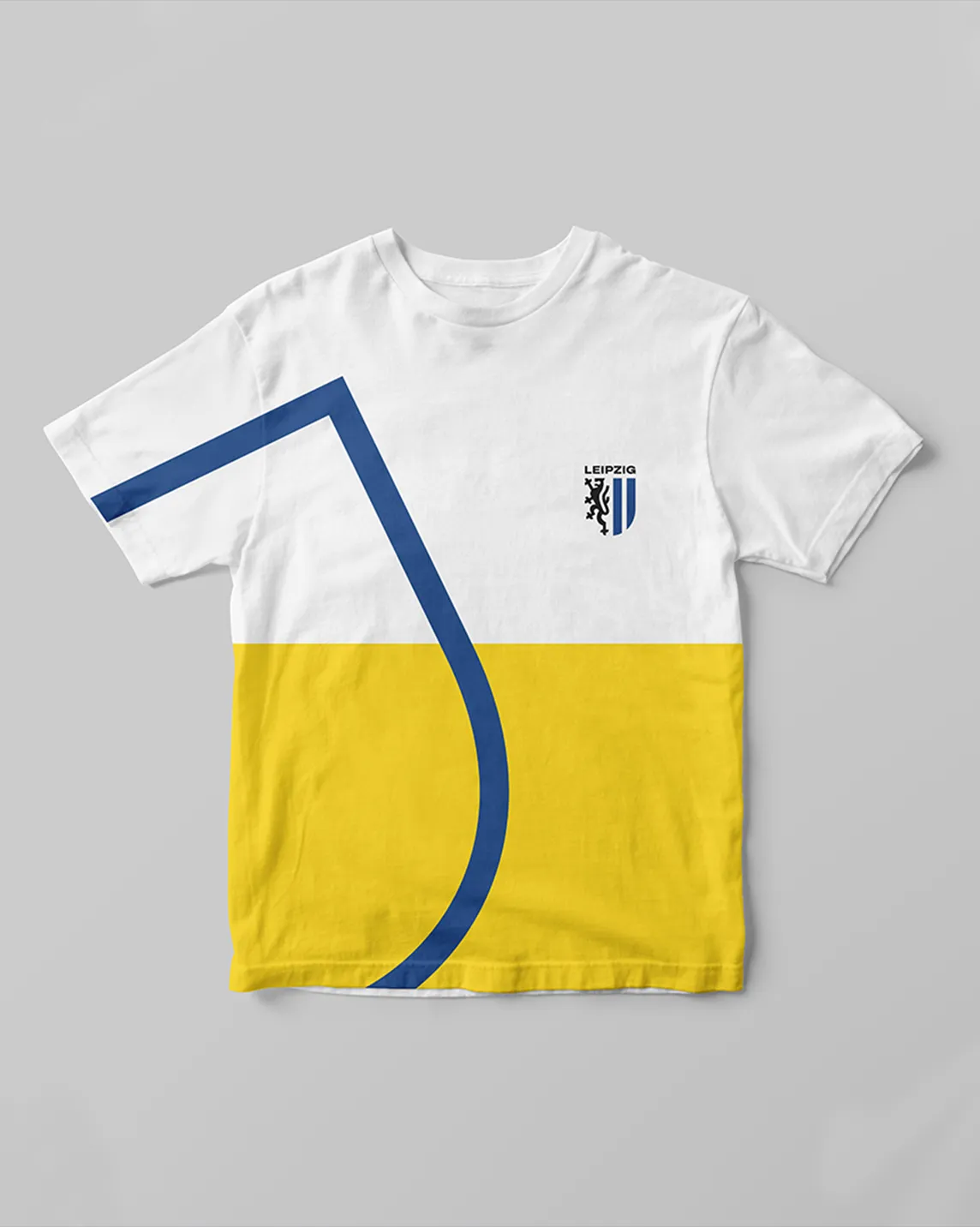
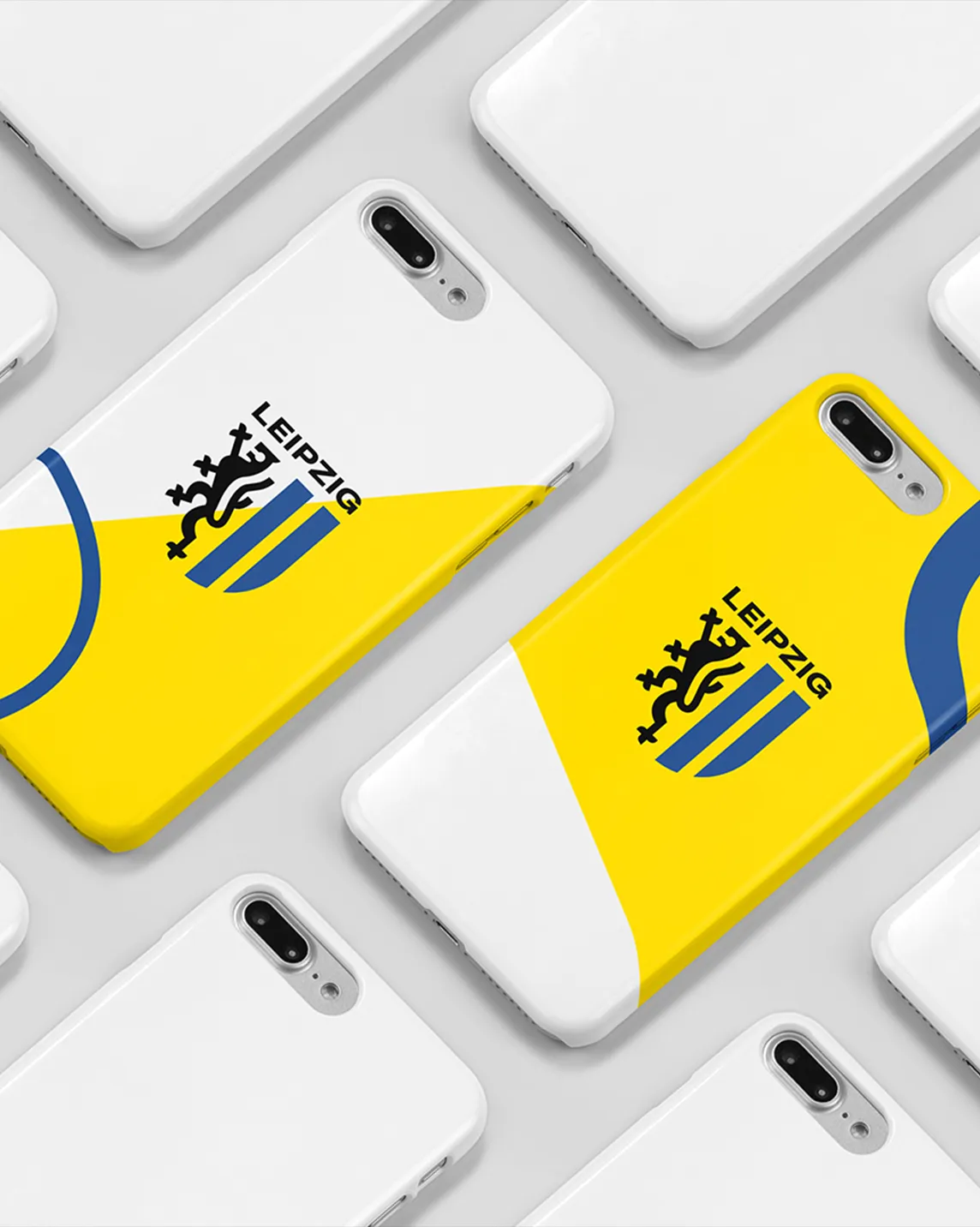
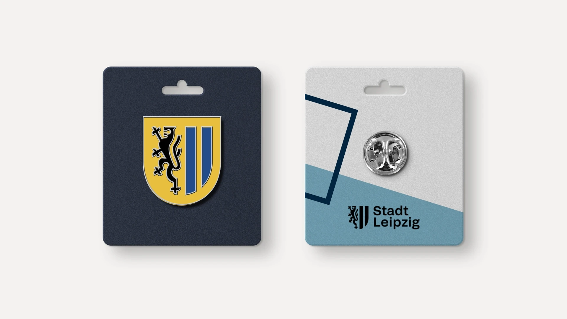
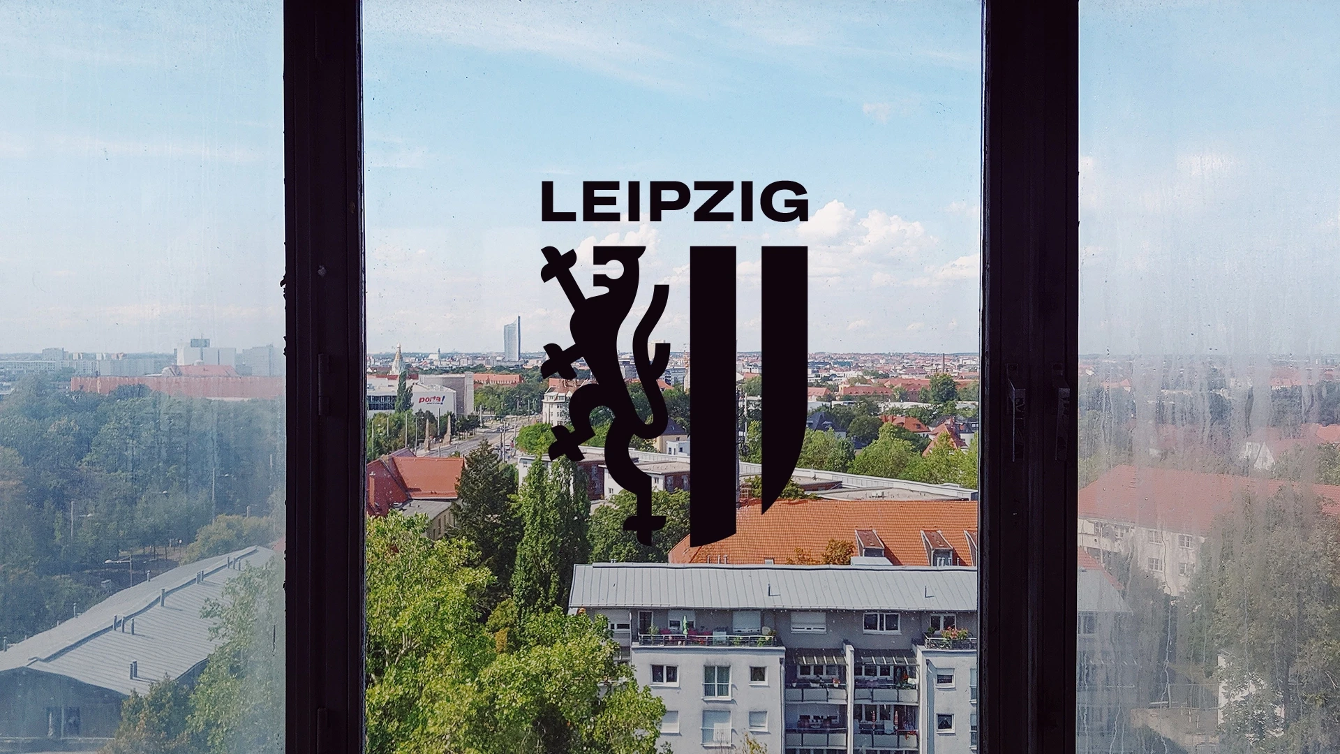
A flexible design system adapts to a range of applications to showcase how expressive and creative to clear and functional it can be. The new variable grotesque font supports the flexible approach. The traditional coat of arms was translated into a simplified logo, optimised for scalability and digital use. The core colour palette celebrates the city’s heraldic colours and can be extended with complementary colours for sub-brands.
Results
The project resulted in a first draft of a rebranding concept, rationale, presentation and application examples. At its core is a unified, adaptable master brand designed to work across the city’s diverse services and departments. Conceived as an open and approachable identity for Leipzig’s citizens, it is built on the belief that a brand can only succeed when people understand it and feel connected to it. The concept was presented to the city administration.